RIFF - Industry Design Project
Helping create an easy, seamless onboarding experience for new users. A collaboration project facilitated by the Springboard bootcamp.
INTRODUCTION
Riff is a startup that helps musicians manage the business side of making music professionally. They provide useful tools for users that monitor sales, connect with collaborators, sell their brands to investors, and more. Riff currently asks users to complete an Electronic Business Kit (EBK) that helps musicians showcase their material similar to a digital resume. Users can feature past projects like album releases, as well as data from Spotify, Plaid, and social media.
Problem:
Riff’s original onboarding flow for the EBK was long, arduous and confusing. User’s had to know every element required to fill out the EBK, causing pain points if users either didn’t know or didn’t have access to the information Riff needed.
Duration: 4 weeks, ~45 hours total
Skills/Tools:
Figma
Sketching
Low-fidelity design
Prototyping
User testing
Stakeholder communication
Mid-project integration
WEEK 1 - Lightning demo, sketching
Riff needed a new onboarding process for their EBK. The original design was more than 20 screens, confusing and difficult to navigate if a user didn’t have all the information Riff needed. Below is an example of the starting page and the finished EBK.
As a design group we decided conducting a lightning demo examining competitors and other products with onboarding flows would be a good way to look at other solutions.
Lightning Demo
Notable solutions include:
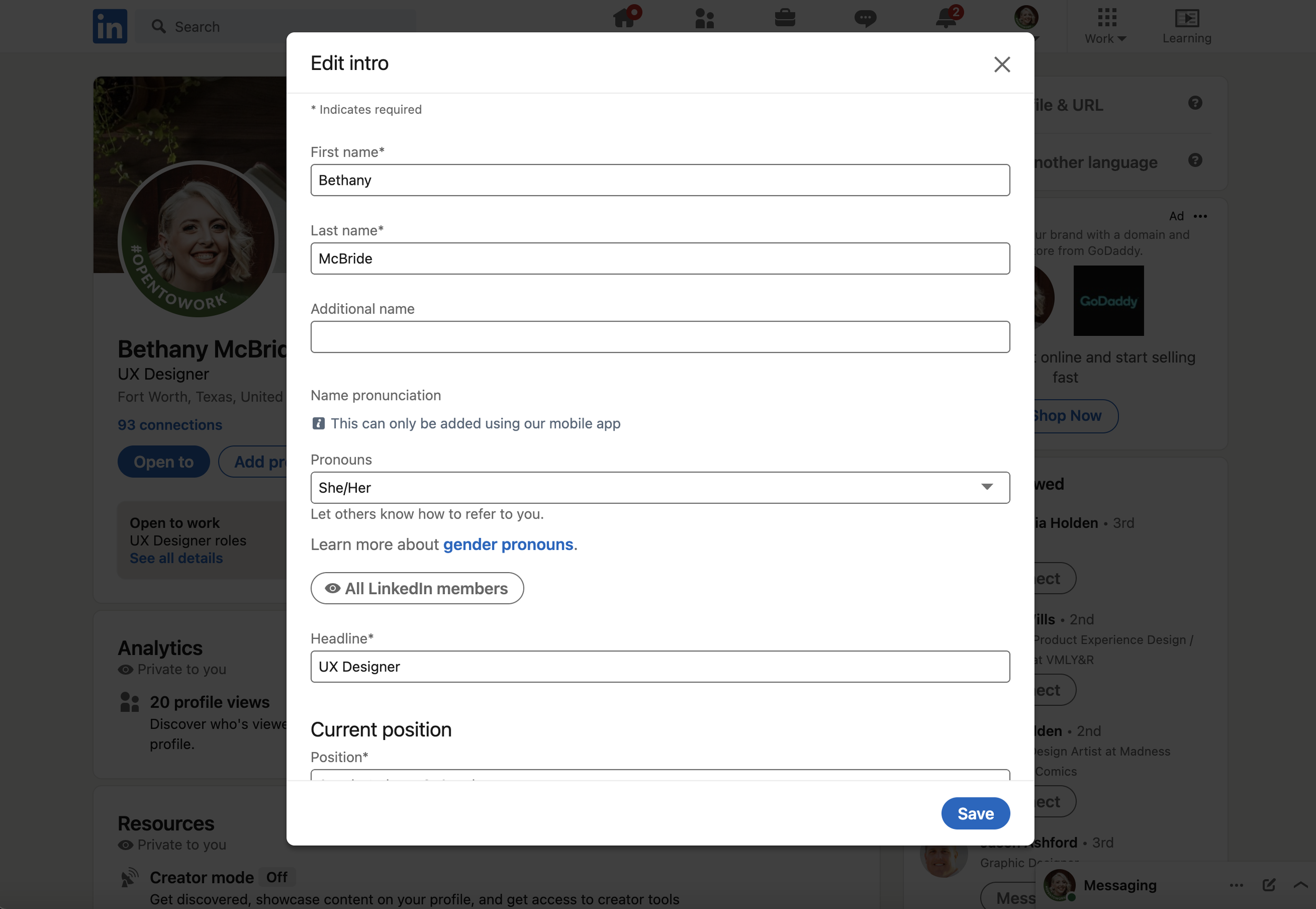
LinkedIn
LinkedIn, like the EBK, requires the user to fill out large amounts of information. They accomplish this through chunking the information into sections that you edit through individual pop-up forms.
IMDb
IMDb communicates vast amounts of information but excels at using hierarchy to emphasize the most important elements and create a natural flow.
Sketches
Stakeholder feedback, lightning demo responses and previous research helped us decide on a ‘chunked’ onboarding flow similar to LinkedIn, using popups for better organization. We also liked the idea of having certain information toggleable, depending on what the user may or may not want to share.
From this point, we created 5-10 sketches focused around pop-ups, the blank slate design, and toggles.
WEEK 2 - Low fidelity mockups
We decided as a team to use the elements Riff was already using in the onboarding flow in our own designs. The decision was made partially due to timeline restraints and also positive feedback from previous testing conducted by Riff.
Bethany McBride handled piecing the low-fidelity screens together with the help of our sketches and team feedback.
Old designs, new flow
There were 3 significant changes made, manifested in the low fidelity mockups -
Toggles for certain elements allow for more customization and gives clients more power to share or hide information.
Popup windows with the appropriate sections shrink the overall onboarding flow to only a few screens while still allowing Riff to gather the necessary information.
A blank slate landing page sets up the experience and provides context for upcoming steps and information.
WEEK 3 - Prototyping
As we pieced together the prototype, there were a few key points that we as a design team decided should be found in our new design and prototype.
Key Design Points:
Is the flow still efficient and easy to navigate?
Are all necessary elements from Riff’s original flow found in ours?
WEEKS 4 and 5 - User Testing
Riff had a user testing pool of artists, investors and individuals who are planning on using Riff upon release. After communicating with the Riff stakeholders to set up interviews, we conducted a total of 4 moderated user tests with Riff stakeholders in attendance.
Testing Goals:
How do users feel about the new designs?
Are there any issues depending on the role of the user? (artist, producer, investor, etc.)
Are there any missing features or suggestions from users?
As a testing group we were concerned about potential railroading during testing. At first, only one journey was available and required users to click on the correct buttons in the correct order to move on. This was in large part due to time restrictions, but over the course of testing we ironed out these issues and eventually had a fully flushed out prototype.
Findings
All of the users we tested liked the new layout and design, with two of them mentioning how easy and intuitive the new flow felt. The user who had seen the previous flow, an agent, expressed how he was excited that all of the elements were arranged in a way that was easy to navigate.
Suggestions:
Two of the three testers mentioned features that were missing from both flows but would be good to have. These included:
More elements from artists to show off their work (in music videos, features, or other capacities)
A personalized touch for artists to make the EBK recognizable as their own.
REFLECTION + CONCLUSION
While I am happy with what we could accomplish in the short time we had, I look forward to more opportunities to see projects through. After having spent the time on this prototype, I would love to build the high-fidelity designs and conduct further testing.
Working with Riff was a great opportunity for me to learn how the design process works in a real-world application. Communication was key - my design group and I met more than 2 times a week for the extent of the project and were constantly communicating on Slack and Discord.
I would like to thank my design team members, Bethany McBride and Kristen Tompkins, for their awesome work and communication skills during this project! Furthermore, I would like to thank the Riff stakeholders for helping us get settled and execute this short internship. They were incredibly helpful with data, testing, and communication.


